Great direct mail design has the ability to capture a recipient’s attention, get them to read and process content, commit to the message, then execute a specific call to action. Although there is no secret formula for direct mail design that will guarantee 100% participation from all recipients, there are best practices marketers should follow to increase brand visibility, response rates, and overall ROI.

First, know the target audience and determine the end goal.

Before starting to develop direct mail copy and design, the following should be clear:  What are the characteristics of the target audience and what is important to them?  Knowing details about the target audience will help determine the appropriate tone to use for copy, which images should be included, and how to structure ideas in a way the target audience will understand.  Also, the more detailed a marketer can be when identifying qualities and characteristics of their audience, the better the opportunity to refine the message for specific segment groups.  For example, a real estate agent directing a postcard to potential home buyers can segment that broad group into specific categories – investment purchasers, renters, first-time home buyers, expanding families, etc.  Each of these segments would have different motivating factor for purchasing a new home; therefore, the message should speak directly to those issues.

Just as important is clarifying the goal for sending a direct mail piece. What is the intended outcome of the piece?  Is the intention of the message to inform, provoke an action, or just to promote awareness of the brand?  Whatever it may be, there should only be one main idea represented on each direct mail piece. Marketers may only have but a few seconds of the target audience’s attention; therefore, marketers need to choose one goal and drive that point throughout the direct mail piece.

Make an impact with a strong headline and bold imagery.

Like reading a newspaper, the headline is the first thing people see before deciding to read the entire article or direct mail piece.  If the headline is strong and thought provoking, the higher the likelihood that it will capture the attention of the target audience.  Effective headlines may include a surprising statistic, an interesting fact, enticing promotional offer, a question or simple statement. Whatever the structure of the headline, it should relate to the rest of the body copy, the intended goal, and to the audience.

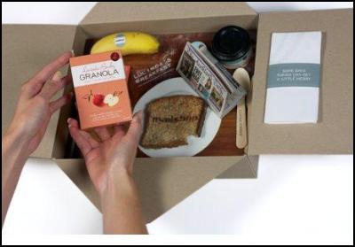
Similarly, visual elements have the power to capture the reader’s attention and evoke emotional response. Use bold colors and choose strong images that speak to core motivations that drive readers toward action. These motivations may include social recognition, self acceptance, love and affection, sense of accomplishment, safety and so on. Using visual elements that trigger these needs can grab the readers’ attention and get them to connect to the message on a deeper level.

Be simple, clear and concise with direct mail messages.

Often times, inexperienced marketers make the mistake of using advanced vocabulary and being too ‘wordy’ when trying to get their point across.  Simplicity and clarity is critical; every sentence should have a purpose and support the ultimate goal.  When reviewing copy, marketers should try to read with the audience’s perspective in mind and ask, “Why should I care? How does this benefit me?”  That exercise might help weed out any unnecessary information and keep marketers focused on being direct with their idea.

Additionally, an effective direct mail piece guides recipients’ behavior by providing a clear call-to-action item. Marketers should be blunt and clear in describing what the next step should be for the recipient. Keep the design of the direct mail piece simple and uncluttered, emphasizing call-to-action items and main ideas.

Include a compelling promotional offer to promote responses.

Highlighting compelling and actionable promotional offers on direct mail pieces such as free or discounted trial, free service consultations, access to valuable information and so on, have the ability to capture a readers’ attention and motivate response. Furthermore, consumers are more likely to provide a fair amount of personal information to redeem a coupon or other promotional offer. For marketers, the advantage of using promotional offers with direct mail is the ability to collect consumer data, identify warm leads, and track direct mail success.

Test, test, and test again.

Once a marketer understands the best practices of direct mail design, they have the opportunity to adjust elements and test what works best for their audience. Split the mailing list in half and always test something; one thing at a time (i.e. – headline only, offer only, positioning of images, etc). Be sure to have a strategy in place to measure responses.

Originally posted by Cynthia Fedor on the directmarketingvoice.com

Direct mail was taken to a new level when Auckland marketing campaigners Mailshop sent breakfast trays to customers that included a printed piece of toast.

The Just for Starters pack — which won a Gold Medal in the Self Promotion Category of this year’s Pride In Print Awards — was the hero of the self-promotion campaign in which recipients received a personally-addressed box to peak the curiosity factor.

Upon opening they encountered their very own breakfast tray, personalised with their own fake newspaper (featuring them) and accompanying cereal, butter, jam and coffee cup. To further enhance the experience the toast was real Vogel’s bread (with “Mailshop” branded onto it) and the banana was a fresh mini Nino banana!

Recipients were directed to a personalised URL (PURL) with the invitation to enter a competition on line, offering a prize of a real breakfast at the Langham Hotel.

The germ of an eye-catching business-to-business mail campaign came when Mailshop moved premises last year and used the opportunity to refresh its visual identity through a logo rebrand. Dashwood Design worked with Mailshop and established a brand essence around the concept “no such thing as ordinary”. The change included a transformation of its website, a new business profile and new signage, stationery, email signatures and vehicles.

A campaign was then devised to showcase the capabilities of Mailshop’s latest Colour 1000 digital press, in particular the broad range of paper substrates and weights it could handle, and to demonstrate to clients what is creatively possible when utilising XMPie software, both online and in digital printing.

Mailshop Managing Director Deidre Ross says the desire was to surprise and delight clients and reinforce the “no such thing as ordinary” idea with a memorable cross-media DM campaign which recipients would want to keep and tell others about, creating conversations about Mailshop to their peers.

“The pack needed to be visually arresting with a high level of customisation and personalisation that would take clients’ breath away and showcase Mailshop’s prowess for detailed execution.

“Timing was critical to heighten the unveiling experience. As a result each pack was hand delivered to companies’ receptions as early as possible prior to 10.30am,” she says.

“The PURL was intended to be a quick and easy experience, a fun extension of the Direct Pack that enabled people to enter the draw and be re-introduced to Mailshop’s broader capabilities. This was subtlety referred to in the breakfast spread. No explanation was given but that did not stop 40% of recipients visiting it and as a result receiving an entry into the draw to win breakfast and a spa for two at the Langham hotel.

“Each pack had a lotto ticket nested into the mini newspaper. The ticket was an important part of the experience as the personalised newspaper showed the recipient being the Lotto ticket winner! It got people involved, they had to go and check it out – anything but ordinary!”

Recipients were high-value Mailshop clients, 120 in total. The mix was advertising agencies and direct marketing clients, chosen due to their activity in the creative direct marketing space.

The campaign resulted in comments such as: “WOW — what an amazing DM I received from Mailshop. Have been so impressed I’ve been showing everyone in the office. It’s great to see such innovation and something tangible in this eWorld we are now living in.”; “Got my awesome breakfast DM box yesterday! Everyone is talking about it around the office. Quick question, is the lotto ticket real?”; and “Thanks for the personalised breakfast box, fabulous! I love the newspaper and especially the lotto ticket inside!! Very clever!! I’ve just entered the draw, fingers crossed!”

Ms Ross says the campaign ignited many client conversations about what is really possible in the DM space and how the latest technology can deliver a more impacting experience that drives results.

Originally posted on www.scoop.co.nz

Tri-Win on Facebook and Twitter

So now you have a great list of prospects and with a little help from last week’s post, Direct Mail Beginning to End – Design, a clever professional looking design that people will want to read your direct mail campaign. This week it’s time to take your creative to a practical place and, sadly, allow real world considerations to start affecting our final outcome. Things like size, shape, paper quality, color, weight all affect what your final costs will be. I know is sounds complicated but if it was all intuitive I wouldn’t need to write this blog would I?

Let’s start with paper quality and finishes. This decision should focus on your aesthetic preference and what impression you want to give to your customers. Do you want to have nice textured 130 pound paper or would 60 pound text paper work for your mailer.  The quality of your paper speaks to the nature of your company.  If you go with the cheapest option your decision to use low quality materials will be obvious to you prospects. Selling a luxury car with uncoated paper that tears as you turn the page will not send the message of quality and status that ultimately sells a $50,000 car. The better quality paper you use the better your mailer looks, but even if you can stand in front of the owner of your business and justify why you spent three dollars for each postcard you mailed you may want to reallocate that funding somewhere else. High quality paper sends a message of quality but too much quality can send the wrong impression. For example, if you use a very expensive stock in a donation direct mail campaign for a local charity you may find that you have sent the impression that the charity has extra income so donations may not be needed after all. Your paper choice should be affected by the message you are trying to send. If this doesn’t make much sense to you talk to your designer. If you have a good artist working for you they will understand what I mean and offer a suggestion or two regarding paper and finishing.

The paper finish: gloss, matt, coated, uncoated, etc. effects the impression your mailer has on a customer, so you need to consider paper finish as part of your impression but the bigger concern is durability. It doesn’t matter what paper you choose if the mailer is destroyed by the time it reaches its destination. Once I made the mistake of printing a direct mail campaign on a gloss finish paper without using a protective coating. By the time it made it thought the mail it looked like someone had used it as sand paper. You can save a little money if you decide not coat the paper with a protective finish but make sure it can survive the post office’s automated processes. You may not need to use coated stock if your mailing goes in an envelope, but any surface of the direct mail piece that is exposed in the mailing process should have a protective coating to avoid damaging the ink.

Now let’s talk about the ink. The more colors that you need to print the more expensive it is to print. Printing one color of ink is going to be your cheapest option. You have options of printing 2, 3 or 4 colors as well. 4 color printing is also called full color since you use cyan, magenta, yellow, and black (CMYK) to reproduce the full spectrum of colors. If you are printing 1, 2, or 3 colors you are probably using a spot color. Spot colors are inks that are mixed before they are put into a printing press to get a certain color and are generally not mixed. That ends today’s remedial ink 101 lesson. With direct mail your printing options are only limited by your budget, but remember the more inks you need the more your cost will be. There are some very creative and eye catching designs made using 1 or 2 color printing so don’t let the concern of ink costs limited the quality of your art. To make sure you are getting the best materials for your money you need to be sure the printer you are working with understands their business and knows when digital printing is better than off-set printing.  Get an expert (pay attention to that expert line I’m going to use it again in next week’s post).

Printing is the first major cost of producing a direct mail campaign. There are decisions that need to be made at this stage of the process that have wrong answers. Very costly wrong answers so get a printer that knows what they are doing! Get an expert ( I guess I used this line sooner than I thought. It must be IMPORTANT!) Make sure your printer is willing to discuss options with you. They should be willing to talk to you about the printing process, and discuss options on what kind of printing would work best for you.  Allow them to make recommendations, but make sure they can tell you why they made those recommendations. Make sure you know how long it will take to get your materials printed. Once you get your mailer printed you will need to deal with the other major cost of a direct mail campaign, postage, and I will deal with that next week in Direct Mail Beginning to End – Postage.

Tri-Win on Facebook and Twitter

People are harsh, at least in regard to direct mail. Even the sweetest little old lady who greets strangers on her morning walk will throw away a direct mail postcard without a second thought. Let’s not think about what that guy you cut you off on the way to work would do. In fact people will only give you about 3 seconds of their time before they decide if they want to read what you sent them, or pile it on top of the credit card bill in the recycling bin. It’s that tiny window of opportunity that makes design so important. Like I said in Direct Mail Beginning to End – Data Lists, your data is the most important part of a direct mail campaign but design comes in a close second.

It’s the design of your direct mail piece that will get you past the 3 second window, and get the recipient to read your message.  While there is no single “best” or “right” way to design a mailer I can give you some fundamentals to think about during the process. First, you need a designer. Your nephew who likes to mess around with Photoshop is NOT a designer. Well, probably not anyway and if you want to create a good mailer you will need to work with someone who not only knows what the terms bleed, cmyk, and ppi mean but can create something that looks professional. Since every direct mail campaign is or SHOULD be unique I can’t help answer questions like what color you should use, or is this font better than that font.  Those are questions that need to be addressed with your designer along with a few other basics.

First things first people need to be informed who you are and what you are offering. If you sending out mailers to clients you have already worked with, or you have a level of brand recognition that Nike would envy than all you need may be a logo.  If you are an unknown then you will need to give the reader a bit more to go off. It may just take a photo, or a slogan but you need something. Remember reading “is no single “best” or “right” way to design a mailer” about 20 seconds ago, there is another approach you might want to take. Give the customer no explanation and see if pure curiosity can drive them to get the information. If I got a postcard in the mail that only had a QR Code I would pull out my phone and find out more.

Next there should be an offer of some kind.  You can offer to give them a discount, you can offer to give them more information, you can offer to give them free kitten with each dog house sold, but you need to offer them something. This is the part of a direct mail piece that appeals to the “what’s in it for me” attitude that permeates American society today so make the offer good. You are not creating a direct mail campaign to use up a budget surplus.

Finally you will want a call to action: come in and get free appetizer, call to hear movie times, register your account and get a free death ray! Tell the person getting the mail how to take advantage of the offer. Directing someone to take action has been proven to work better than simply telling them about the deal. Your call to action can be as direct as “Come buy my Nachos!” or it might be more passive like “When you get a moment, log in and see what we can do for you.” The best call to action is dependent on who are marketing to at the time, and you will probably want to talk to your copy writer about what will work best.

Now here is the tricky part you need to hit all three points in a way that is personal to each person who receives the mailer. Since you have a good data list you know enough about your targets so you can integrate their name into the mailing as a first step. Then you can use a series of images to talk to a potential client on an emotional level. If you know your customer likes to sail thanks to a data list that includes hobbies include some images of people using your product on a boat.  If your client is a college professor include academic related images.  If the prospect is a mechanic a picture of grimy hands is a way to connect. Reach out in an emotional way with imagery, and logical way with facts to get the best chance to connect to a potential new sale. If you are concerned about the complexity of creating a direct mail campaign with this level of detail don’t be. It is much simpler than you may think. Variable data printing allows you to print all the direct mail pieces in one run while changing the images and names on each individual mailer.  Designing a direct mail campaign that truly is customized to each recipient will increase response rate, and get you a better return on your investment.

Your design is what will catch people’s attention, get them to read your message, and get you past the 3 second trashing. Think about how many number 10 envelopes you get in the mail every day, then thing about how many triangle shaped self mailers you get in the mail. Are you going to be more likely to spend more time looking at the standard form letter or a three panel self mailer tied with a bow? The unique piece will always get more attention but creativity costs money. The post office does its job very well, but they do not embrace creativity. This is might be a bit obvious but I’m going to say it anyway; the size and shape of your direct mail piece directly affects how much it costs to produce and mail.  Next week I will start to talk about automation and post office regulations and how to create something that won’t use all or your annual advertising budget.

Tri-Win on Facebook and Twitter